Github Trends: a network-based recommender for open source packages
Data science capstone project mining open source code for insights, built in 2 weeks
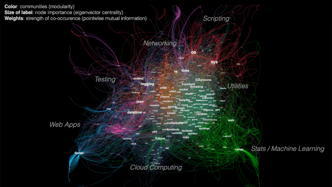
Figure 1. The Python package universe, compared to those taught at Galvanize.
Table of Contents
- Motivation
- The Database
- Interactive Visualization of Usage Trends
- Network Analysis and Recommender
- Text Mining and Prediction
- The Web App
- About the Author
- References
1 Motivation
Open source software has accelerated innovation and enabled collaboration for people and organizations all over the world. However, discoverability of new technologies has not caught up with its fast-growing availability. As a result, finding new packages is a challenge for learners who may be new to a topic or to coding entirely. Package managers like pip and Anaconda provide a rich index of packages, but are not as helpful in exposing users to new packages.
GitHub recently made activity data for over 3 million open source repositories available on Google BigQuery, making it one of the largest datasets on collaboration.
“Just as books capture thoughts and ideas, software encodes human knowledge in a machine-readable form. This dataset is a great start toward the pursuit of documenting the open source community’s vast repository of knowledge.” – GitHub blog
GitHub Trends was created by mining open source code for insights on open source package adoption and relationships within a network. Use cases include:
- Helping users compare packages and see which ones are gaining more momentum
- Recommending new packages that are relevant to packages users may already be using
2 The Database

Figure 2. Data workflow from raw code to web app.
The data I used came from two tables that totaled 2TB in size on BigQuery. The contents table included code at the file level, and the commits table included timestamps at the commit level. For the scope of this 2-week project, I limited my data to the Python language which is 7% of repos, and used an extract available for Python contents that made the joins less massive.

Figure 3. Languages used in GitHub repos. [image source]
When querying the data, I wanted to take advantage of Google’s compute engine and do as much data processing that made sense using SQL on BigQuery prior to exporting the data. This included extracting package imports using regular expressions. My final table had file IDs along with each file’s package imports nested. You can see the SQL queries here: bigquery.sql.

Figure 4. Package name extraction from Python code.
2.1 Time Series Data
The tricky part in handling dates was that there were both author dates and commit dates (read about their differences here), and multiple values for these dates for each file (multiple diffs). The data did not include file content changes in each diff. I could have chosen the earliest date, latest date, median date, average date, etc. I decided to go with the earliest author date and assumed that the onset of intention to use a package was the most important. To prepare the data for easy querying on the web app, I stored the count of package imports in a PostgreSQL database, and set package name and date as indices of the table.
2.2 Network Data
To get the edge (package connections) pairs, I need to count each combination of packages for each file. Doing this in SQL would involve self joins and a lot of computation, so I decided to export the data and use MapReduce to parallelize the process. This could be done for 4 million files in a couple of minutes using Amazon EMR (Elastic MapReduce) to split the work across multiple machines. You can see the MapReduce code here: mr_edges.py and mr_nodes.py.

Figure 5. MapReduce to parallelize computation for edge counts.
3 Interactive Visualization of Usage Trends

Figure 6. Interactive plot created using mpld3.
For the time series portion of the web app, users can input a list of packages and the app will return an interactive plot created using mpld3. Similar to Google Trends, the highest value on the plot is set to 100 and the other values are scaled proportionally for comparison on a relative basis.
This plot was made using mpld3, a Python toolkit that enables you to write code for matplotlib, and then export the figure to HTML code that renders in D3, a JavaScript library for interactive data visualizations.
4 Network Analysis and Recommender
The network of packages had 60,000 nodes and 850,000 edges after I removed pairs that occured less than 5 times. I used networkx in Python to organize the network data, node attributes, and edge attributes into a .gml file that can be read into Gephi for visualization. I used igraph in Python to power the recommender. You can see the network analysis code here: network_recommender.py.
The goal of the project is to expose packages that may not be the most widely used, but are the most relevant and have the strongest relationships. Metrics like pointwise mutual information, eigenvector centrality, and Jaccard similarity were chosen to highlight strong relationships even for less popular packages.

Figure 7. Influence of edge weights and centrality metric on network visualization.
4.1 Edge Weights
Edge weights represent the strength of a relationship between two packages. However, if I simply determined the strength of a relationship based on edge counts (number of times they co-occur), smaller packages would get overshadowed by large packages even if they had a stronger relationship. Instead, I decided to use pointwise mutual information (PMI), which not only takes into the joint probability of 2 packages occuring, but also their individual probabilities. This value can be normalized between [-1,+1].

To visualize the network, I used a force-directed layout in Gephi called ForceAtlas 2, which took into account the edge weights in the calculation of attraction and repulsion forces. Packages with a strong relationship attract, while packages with weak or no relationship repel. Gephi has different layouts depending on what features you want to highlight.
4.2 Node Importance

Figure 8. Comparison of different centrality metrics on the same graph. [image source]
A few different metrics can be used to determine node importance: degree centrality, betweenness centrality, and eigenvector centrality. They are proportional to the following (prior to normalization):
- Degree: number of neighbors a node has
- Betweenness: number of shortest paths throughout the network that pass through a node
- Eigenvector: sum of a node’s neighbors’ centralities
Degree centrality made most packages disappear with the exception of the big ones that are more generally used (os, sys). Betweenness centrality had a similar result, likely influenced by the edge weights. Eigenvector centrality looked the best visually and made the most sense in terms of the objectives of this project: to recommend packages that may not be the most widely used, but are the most relevant. The assumption is that a node’s importance depends more on the quality of its connections rather than the quantity. Google’s PageRank algorithm used to order search engine results is a variant of eigenvector centrality.
4.3 Node Similarity
To make similarity recommendations for a given package of interest, I want to identify neighboring packages that are structurally similar in the network. I used Jaccard similarity to rank a list of a node’s first degree neighbors as recommendations for most similar packages, which is calculated by the number of common neighbors divided by the union of the neighbors of both packages. This metric determines node similarity in context of the network structure, rather than just individual node attributes.
Jaccard similarity is used for ranked recommendations alongside pointwise mutual information (“weighted co-occurence”), and a raw edge count. I found that the raw count typically returns recommendations that are more generally popular, while the left two metrics return more highly relevant or specific packages. In the example below for networkx (a package for network analysis), top recommended packages include Bio (computational biology), nltk (natural language processing), and pycxsimulator (dynamic graph simulation), all of which point to more specific use cases for networkx.

Figure 9. Screenshot from the network-based recommender app. [see demo]
4.4 Communities
Modularity is a measure of how densely connected a community is based on the number of edges that are within a community compared to the expected number that would exist at random, holding the number of degrees constant. A community should have denser connections within itself and sparser connections to other communities. Gephi allows you to color nodes based on “Modularity Class.” You can tweak the community detection algorithm resolution to show more of fewer communities.
| Node Importance Ranking by Eigencentrality | Scripting / Testing | Web Apps | Math / Machine Learning | Utilities | Cloud Computing |
|---|---|---|---|---|---|
| 1 | os | DateTime | __future__ | collections | uuid |
| 2 | sys | json | numpy | random | six |
| 3 | time | django | math | subprocess | mock |
| 4 | logging | flask | matplotlib | traceback | sqlalchemy |
| 5 | re | util | scipy | urllib | eventlet |
| 6 | unittest | nose | pandas | ConfigParser | abc |
| 7 | pytest | pytz | sklearn | threading | nova |
| 8 | PyQt4 | xmodule | pylab | tempfile | oslo_config |
Table 1. Top five communities via modularity, with human-assigned labels.
5 Text Mining and Prediction
Analysis of package description text coming soon. Workstreams I have tried:
- Scrape pypi.python.org/simple for package descriptions and summaries
- Write a script to pip install all packages in a virtual environment, import each package in Python, and get its docstring through the __doc__ method
- Extract all __init__.py file docstrings from the BigQuery GitHub repos dataset
The remaining challenge is mapping the package import name (used in this project) and the pip install name. For example, in order to import sklearn, you need to install scikit-learn. Please reach out if you have a suggested solution!
6 The Web App
The web app was built using Flask app.py and consists of two components:
- Interactive visualization of package usage trends

- Network-based recommender - allows users to traverse through the network based on similar or complementary packages
- Ranked recommendations from Jaccard similarity and normalized pointwise mutual information tend to return packages that may be less widely used but are more highly relevant, while those from a raw count are more generally popular packages

Currently working to add package descriptions and topics. Live app coming soon - stay tuned!
7 References
-
“Visualizing Relationships Between Python Packages”, blog by Robert Kozikowski.
-
“Social Network Analysis (SNA): Tutorial on Concepts and Methods”, presentation by Dr. Giorgos Cheliotis, National University of Singapore.
-
Leicht E.A., Holme P., Newman M.E.J., 2016. “Vertex similarity in networks”. Physical Review E 73 (2), 026120.