User Churn Prediction: A Machine Learning Example
In this post, I will be walking through a machine learning workflow for a user churn prediction problem. The data is from a ride-sharing company and was pulled on July 1, 2014. Our objective for this post is to predict users who are likely to churn so that the company can prevent them from doing so with offers/incentives using sklearn.
I will extend this example in a separate post later to explain what features may be drivers of user churn by interpreting model coefficients and feature importances. For the purposes of this post, our goal is to predict activity/churn with optimal performance.
Background
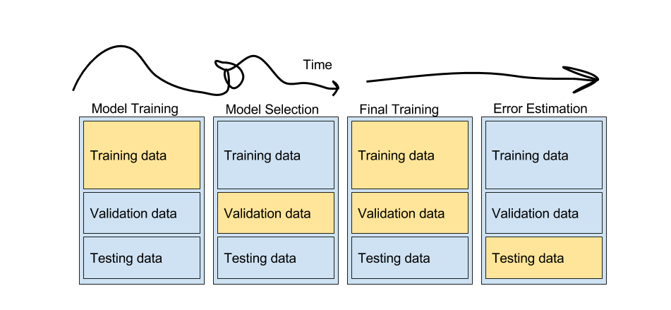
A typical machine learning workflow is shown in the image below. There are no universally correct steps to follow and this blog post shows one approach. The “art” in the process is at the squiggly part of the line below. You could go back and forth with testing different models, features, hyperparameters, error measures, ensembling…
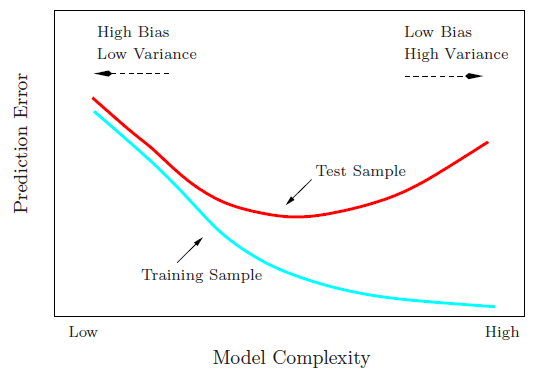
It is important to hold out sets of your data that will remain “unseen” by the model at each decision point in order to get a noninflated measure of model performance. If we used all of our data to train our model from the start, our model would learn that piece of training data really well (overfit), but may fail to generalize to other data it has not seen. As the model becomes more complex, training error will monotonically increase while test error increases to a certain point, and then starts to decrease due to overfitting.
Bias-Variance trade-off and overfitting
Tutorial Outline
- Loading the Data
- Handing Missing Values
- Exploratory Data Analysis
- Data Pipeline
- Model Training and Model Selection
- Hyperparameter Tuning
1. Loading the Data
For this analysis, I will use pandas for data manipulation, matplotlib and seaborn for plotting, and sklearn for machine learning. I will also use sklearn_pandas and sklearn.pipeline to set up our model pipeline.
from pandas.tools.plotting import scatter_matrix
from sklearn.cross_validation import train_test_split
from sklearn.ensemble import GradientBoostingClassifier, RandomForestClassifier
from sklearn.feature_extraction.text import CountVectorizer
from sklearn.linear_model import LogisticRegression
from sklearn.metrics import roc_auc_score, f1_score, confusion_matrix
from sklearn.model_selection import GridSearchCV
from sklearn.pipeline import Pipeline
from sklearn.preprocessing import StandardScaler, LabelEncoder, LabelBinarizer
from sklearn_pandas import DataFrameMapper, cross_val_score
import datetime
import matplotlib.pyplot as plt
import numpy as np
import pandas as pd
import seaborn as sns
%matplotlib inline

# Set font size for plotting
sns.set(font_scale=1.5)
df = pd.read_csv('data/churn.csv', parse_dates=['last_trip_date', 'signup_date'])
df.head()
| avg_dist | avg_rating_by_driver | avg_rating_of_driver | avg_surge | city | last_trip_date | phone | signup_date | surge_pct | trips_in_first_30_days | luxury_car_user | weekday_pct | |
|---|---|---|---|---|---|---|---|---|---|---|---|---|
| 0 | 3.67 | 5.0 | 4.7 | 1.10 | King's Landing | 2014-06-17 | iPhone | 2014-01-25 | 15.4 | 4 | True | 46.2 |
| 1 | 8.26 | 5.0 | 5.0 | 1.00 | Astapor | 2014-05-05 | Android | 2014-01-29 | 0.0 | 0 | False | 50.0 |
| 2 | 0.77 | 5.0 | 4.3 | 1.00 | Astapor | 2014-01-07 | iPhone | 2014-01-06 | 0.0 | 3 | False | 100.0 |
| 3 | 2.36 | 4.9 | 4.6 | 1.14 | King's Landing | 2014-06-29 | iPhone | 2014-01-10 | 20.0 | 9 | True | 80.0 |
| 4 | 3.13 | 4.9 | 4.4 | 1.19 | Winterfell | 2014-03-15 | Android | 2014-01-27 | 11.8 | 14 | False | 82.4 |
df.info()
<class 'pandas.core.frame.DataFrame'>
RangeIndex: 50000 entries, 0 to 49999
Data columns (total 12 columns):
avg_dist                  50000 non-null float64
avg_rating_by_driver      49799 non-null float64
avg_rating_of_driver      41878 non-null float64
avg_surge                 50000 non-null float64
city                      50000 non-null object
last_trip_date            50000 non-null datetime64[ns]
phone                     49604 non-null object
signup_date               50000 non-null datetime64[ns]
surge_pct                 50000 non-null float64
trips_in_first_30_days    50000 non-null int64
luxury_car_user           50000 non-null bool
weekday_pct               50000 non-null float64
dtypes: bool(1), datetime64[ns](2), float64(6), int64(1), object(2)
memory usage: 4.2+ MB
Let’s create a label for active users for our models to predict. If a user is not active, they will be considered churn users.
# 30 days before the data pull date
date_cutoff = df['last_trip_date'].max() - datetime.timedelta(30, 0, 0)

# A retained user is "active" if they took a trip within 30 days of the data pull date
df['active'] = (df['last_trip_date'] > date_cutoff).astype(int)
2. Handling Missing Values
A few options:
- Remove all rows with missing values
- Impute the missing values (with mean, median, mode for a particular feature)
- Bin variables with missing values and add a level for ‘missing’
The first two are appropriate when we are confident that values are missing at random. We have missing values for avg_rating_by_driver, avg_rating_of_driver, and phone features. Let’s see if values are missing at random by seeing whether there is an effect on whether a user is active. To do this, we can look at whether there is a signicant difference in percent active users in users who have vs. don’t have missing values.
import scipy.stats as scs

def run_ttest(feature, condition):
    '''
    Function to run t-test for a given column from a dataframe.

    INPUT feature (pandas series): column of interest
    INPUT condition (boolean): condition to t-test by
    OUTPUT:
    '''
    ttest = scs.ttest_ind(feature[condition], feature[-condition])
    print '===== T-test for Difference in Means ====='
    print 'User count: {} vs. {}'.format(len(feature[condition]), len(feature[-condition]))
    print 'Mean comparison: {} vs. {}'.format(feature[condition].mean(), feature[-condition].mean())
    print 'T statistic: {}'.format(ttest.statistic, 4)
    print 'p-value: {}'.format(ttest.pvalue)
The few missing phone values may be negligible as there was not a significant effect on user activity (p>.05). Given that missing values are random, and there are only 396 missing values out of 50000, we can go ahead and drop rows with missing phone data.
# Effect of missing phone values
run_ttest(df['active'], df['phone'].isnull())
===== T-test for Difference in Means =====
User count: 396 vs. 49604
Mean comparison: 0.328282828283 vs. 0.366502701395
T statistic: -1.57245036678
p-value: 0.115852468875
# Remove rows where phone values are missing
df = df[df['phone'].notnull()]
It looks like there is an effect of both missing avg_rating_by_driver and avg_rating_of_driver on the activity of a user.
# Effect of missing ratings by driver
run_ttest(df['active'], df['avg_rating_by_driver'].isnull())
===== T-test for Difference in Means =====
User count: 198 vs. 49406
Mean comparison: 0.171717171717 vs. 0.367283325912
T statistic: -5.70138430771
p-value: 1.19511322468e-08
# Effect of missing ratings of driver
run_ttest(df['active'], df['avg_rating_of_driver'].isnull())
===== T-test for Difference in Means =====
User count: 8026 vs. 41578
Mean comparison: 0.194119112883 vs. 0.399778729136
T statistic: -35.4474158072
p-value: 8.06093761267e-272
Since the missing values aren’t random, we shouldn’t remove or impute rows with missing values. Instead, we can create a categorical variable with ‘missing’ as a bin. If we look at the distribution of ratings, we see that most people rate a 5. We should try to balance our bins somewhat.
def add_binned_ratings(df, old_col, new_col):
    '''
    Add column for binned ratings.

    INPUT:
    - df (full dataframe)
    - old_col (str): column name of average ratings
    - new_col (str): new column name for binned average ratings
    OUTPUT:
    - new dataframe
    '''
    df[new_col] = pd.cut(df[old_col].copy(), bins=[0., 3.99, 4.99, 5],
                            include_lowest=True, right=True)
    df[new_col].cat.add_categories('Missing', inplace=True)
    df[new_col].fillna('Missing', inplace=True)
    return df

df = add_binned_ratings(df, 'avg_rating_by_driver', 'bin_avg_rating_by_driver')
df = add_binned_ratings(df, 'avg_rating_of_driver', 'bin_avg_rating_of_driver')

# Delete previous rating columns
df.drop(['avg_rating_by_driver', 'avg_rating_of_driver'], axis=1, inplace=True)
3. Exploratory Data Analysis
It’s always good to have some hypotheses in mind before diving into modeling, and exploratory analysis can help in generating them.
- Users who use the app more (higher
trips_in_first_30_daysandweekday_pct) are probably more likely to remain active - Users who experience more surge (
avg_surve) may be less satisfied and more likely to churn luxury_car_usermay be the premium users with higher willingness to pay who are less likely to churn- Those in less metropolitan areas may be more likely to churn due to lower driver supply
- As we saw from above, most people rate 5’s for
avg_rating_by_driverandavg_rating_of_driverand it may be a more passive action as opposed to a meaningful one
Only 37% of users are labeled as active, or 63% of users churn.
df['active'].value_counts()/len(df['active'])
0    0.633497
1    0.366503
Name: active, dtype: float64
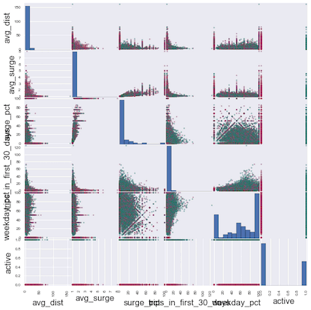
From the scattermatrix below, there does not appear to be any one clear variable that divides active vs. inactive users.
colors = ['green' if x else 'red' for x in df['active']]

numeric_cols = list(df.dtypes[(df.dtypes=='float') | (df.dtypes=='int')].index.values)

scatter_matrix(df[numeric_cols], figsize=(10, 10), diagonal='hist', color=colors)
plt.show();
4. Data Pipeline
df.info()
<class 'pandas.core.frame.DataFrame'>
Int64Index: 49604 entries, 0 to 49999
Data columns (total 13 columns):
avg_dist                    49604 non-null float64
avg_surge                   49604 non-null float64
city                        49604 non-null object
last_trip_date              49604 non-null datetime64[ns]
phone                       49604 non-null object
signup_date                 49604 non-null datetime64[ns]
surge_pct                   49604 non-null float64
trips_in_first_30_days      49604 non-null int64
luxury_car_user             49604 non-null bool
weekday_pct                 49604 non-null float64
active                      49604 non-null int64
bin_avg_rating_by_driver    49604 non-null category
bin_avg_rating_of_driver    49604 non-null category
dtypes: bool(1), category(2), datetime64[ns](2), float64(4), int64(2), object(2)
memory usage: 4.3+ MB
No more missing values! To prepare our data for modeling, we need all values to be numeric in order to be valid inputs for sklearn. We will have to do some transforms on our categorical variables and create dummy variables. Here’s an illustration of what this means:
x = df['city'].head()
dummies = pd.get_dummies(x, prefix='city')
pd.concat([x, dummies], axis=1)
| city | city_Astapor | city_King's Landing | city_Winterfell | |
|---|---|---|---|---|
| 0 | King's Landing | 0.0 | 1.0 | 0.0 |
| 1 | Astapor | 1.0 | 0.0 | 0.0 |
| 2 | Astapor | 1.0 | 0.0 | 0.0 |
| 3 | King's Landing | 0.0 | 1.0 | 0.0 |
| 4 | Winterfell | 0.0 | 0.0 | 1.0 |
Using a pipeline for data transformations and scaling
Transformations - another way to do the above is by using a transformer from sklearn.preprocessing called LabelBinarizer. Rather than doing these transformations one by one and then stitching everything back together, I am going to create a pipeline using a combination of sklearn-pandas and sklearn's pipeline to organize various data transformations. sklearn-pandas is great for doing transformations on specific columns from a dataframe. More on the differences between the two libraries here.
Scaling your data is important when your variables have units on different orders of magnitude. You want to standardize values so that variables with a bigger unit don’t drown out smaller ones. (Example: determining key predictors of how quickly a house will sell - number of bedrooms vs. sale price in dollars)
It is good practice to use a pipeline for machine learning because it:
- Keeps track of all the transformations and scaling that you do on your data
- Easily applies any processing you did on your training set to your test set (remember these from a few paragraphs ago?)
Remember that our test set needs to remain completely unseen by any of our modeling - this applies to scaling the data as well. You can think of scaling as part of our modeling. Whatever mean and standard deviation we use to scale the training data, we need to use to scale the test data in model validation. Pipeline makes this easy.
# Create dataframe mapper in preparation for sklearn modeling, which takes numeric numpy arrays
mapper = DataFrameMapper([
        ('avg_dist', None),
        ('avg_surge', None),
        ('city', LabelBinarizer()),
        ('phone', LabelBinarizer()),
        ('surge_pct', None),
        ('trips_in_first_30_days', None),
        ('luxury_car_user', LabelEncoder()),
        ('weekday_pct', None),
        ('bin_avg_rating_by_driver', LabelBinarizer()),
        ('bin_avg_rating_of_driver', LabelBinarizer()),
])
Here’s an example of a pipeline that we’ll incorporate later in our modeling, for logistic regression.
lr_pipeline = Pipeline([
        ('featurize', mapper),
        ('scale', StandardScaler()),
        ('classifier', LogisticRegression())
        ])

# We can use this as if it were our model:
# lr_pipeline.fit(X_train, y_train)
# lr_pipeline.predict(X_test, y_test)
# etc...
5. Model Training and Model Selection
First, we’ll split our variables into features (X) and labels (y), and split our data into a training (80%) and test (20%) set.
X = df.copy()
y = X.pop('active')
X_train, X_test, y_train, y_test = train_test_split(X, y, test_size=0.20)
Metrics for Model Comparison
- Test accuracy - how many times the model gets it right (true positives and true negatives)
- We have relatively balanced classes with active vs. churn users so accuracy is okay to use, but if we had more imbalanced classes (like in the case of predicting a rare disease), we may want to consider both precision and recall (F1 score) rather than just accuracy.
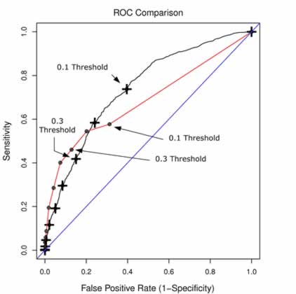
- ROC plot and AUC (area under the curve) - shows the trade-off between true positive rate (sensitivity) and false positive rate (1 - specificity).
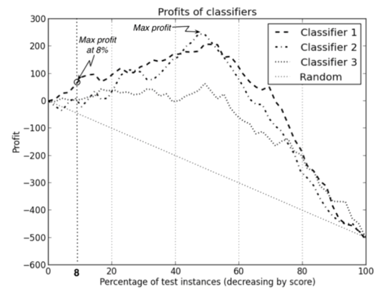
- We will use this to compare models. Typically, the model with a higher AUC (the curve that is tucked closer towards the upper left corner) is the “better” model and you want to pick the threshold at the elbow. However, the “better” model could also depend on our tolerance for false positives. In the example below, the red and black curves are from 2 different models. If we require a lower false positive rate, the red model would be the better choice. If we don’t mind a higher false positive rate, the black model may be better.
- See below for our churn prediction ROC plot.
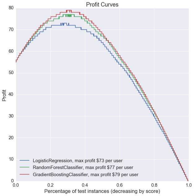
- Profit curve - takes into account dollar costs/benefits associated with true positives, false positives, true negatives, and false negatives.
- A profit curve can help optimize overall profit and help you select the best model and predicted probability threshold. What’s the cost to the company of your model predicts incorrectly? What’s the added value if it predicts correctly? etc.
- See more detail below for our churn prediction example.
Function Definitions
Accuracy is already available through sklearn. We will have to write functions for the ROC plot and profit curves.
ROC plot functions:
def roc_curve(y_proba, y_test):
    '''
    Return the True Positive Rates, False Positive Rates and Thresholds for the
    ROC curve plot.

    INPUT y_proba (numpy array): predicted probabilities
    INPUT y_test (numpy array): true labels
    OUTPUT (lists): lists of true positive rates, false positive rates, thresholds
    '''

    thresholds = np.sort(y_proba)

    tprs = []
    fprs = []

    num_positive_cases = sum(y_test)
    num_negative_cases = len(y_test) - num_positive_cases

    for threshold in thresholds:
        # With this threshold, give the prediction of each instance
        predicted_positive = y_proba >= threshold
        # Calculate the number of correctly predicted positive cases
        true_positives = np.sum(predicted_positive * y_test)
        # Calculate the number of incorrectly predicted positive cases
        false_positives = np.sum(predicted_positive) - true_positives
        # Calculate the True Positive Rate
        tpr = true_positives / float(num_positive_cases)
        # Calculate the False Positive Rate
        fpr = false_positives / float(num_negative_cases)

        fprs.append(fpr)
        tprs.append(tpr)

    return tprs, fprs, thresholds.tolist()

def plot_roc_curve(pipeline, y_pred, y_proba, y_test):
    '''
    Plot ROC curve with data from function above.
    '''
    tpr, fpr, thresholds = roc_curve(y_proba, y_test)

    model_name = pipeline.named_steps['classifier'].__class__.__name__
    auc = round(roc_auc_score(y_test, y_pred), 3)
    plt.plot(fpr, tpr, label='{}, AUC: {}'.format(model_name, auc))
Profit curve functions:
def standard_confusion_matrix(y_true, y_pred):
    '''
    Reformat confusion matrix output from sklearn for plotting profit curve.
    '''
    [[tn, fp], [fn, tp]] = confusion_matrix(y_true, y_pred)
    return np.array([[tp, fp], [fn, tn]])

def plot_profit_curve(pipeline, costbenefit_mat, y_proba, y_test):
    '''
    Plot profit curve.

    INPUTS:
    - model object
    - cost benefit matrix in the same format as the confusion matrix above
    - predicted probabilities
    - actual labels
    '''

    # Profit curve data
    profits = [] # one profit value for each T (threshold)
    thresholds = sorted(y_proba, reverse=True)

    # For each threshold, calculate profit - starting with largest threshold
    for T in thresholds:
        y_pred = (y_proba > T).astype(int)
        confusion_mat = standard_confusion_matrix(y_test, y_pred)
        # Calculate total profit for this threshold
        profit = sum(sum(confusion_mat * costbenefit_mat)) / len(y_test)
        profits.append(profit)

    # Profit curve plot
    model_name = pipeline.named_steps['classifier'].__class__.__name__
    max_profit = max(profits)
    plt.plot(np.linspace(0, 1, len(y_test)), profits, label = '{}, max profit ${} per user'.format(model_name, max_profit))
Model Classifier Object
I will use a class object to store our models for easier comparison. It’s generally good to start with a simple model (logistic regression) before jumping into more complex ones (random forest) to establish baseline performance. In some cases, simply predicting the outcome label with the mean of a feature could potentially perform better than a fancy random forest model.
class Classifiers(object):
    '''
    Classifier object for fitting, storing, and comparing multiple model outputs.
    '''

    def __init__(self, classifier_list):

        self.classifiers = classifier_list
        self.classifier_names = [est.__class__.__name__ for est in self.classifiers]

        # List to store pipeline objects for classifiers
        self.pipelines = []

    def create_pipelines(self, mapper):

        for classifier in self.classifiers:
            self.pipelines.append(Pipeline([
                ('featurize', mapper),
                ('scale', StandardScaler()),
                ('classifier', classifier)
                ]))


    def train(self, X_train, y_train):

        for pipeline in self.pipelines:
            pipeline.fit(X_train, y_train)


    def accuracy_scores(self, X_test, y_test):

        # Lists to store classifier test scores
        self.accuracies = []

        for pipeline in self.pipelines:
            self.accuracies.append(pipeline.score(X_test, y_test))

        # Print results
        accuracy_df = pd.DataFrame(zip(self.classifier_names, self.accuracies))
        accuracy_df.columns = ['Classifier', 'Test Accuracies']

        print accuracy_df


    def plot_roc_curve(self, X_test, y_test):

        # Plot ROC curve for each classifier
        plt.figure(figsize=(10, 10))
        for pipeline in self.pipelines:
            y_pred = pipeline.predict(X_test)
            y_proba = pipeline.predict_proba(X_test)[:, 1]
            plot_roc_curve(pipeline, y_pred, y_proba, y_test)

        # 45 degree line
        x = np.linspace(0, 1.0, 20)
        plt.plot(x, x, color='grey', ls='--')

        # Plot labels
        plt.xlabel('False Positive Rate (1 - Specificity)')
        plt.ylabel('True Positive Rate (Sensitivity, Recall)')
        plt.title('ROC Plots')
        plt.legend(loc='lower right')
        plt.show()


    def plot_profit_curve(self, costbenefit_mat, X_test, y_test):

        # Plot profit curve for each classifier
        plt.figure(figsize=(10, 10))
        for pipeline in self.pipelines:
            y_proba = pipeline.predict_proba(X_test)[:, 1]
            plot_profit_curve(pipeline, costbenefit_mat, y_proba, y_test)

        # Plot labels
        plt.xlabel('Percentage of test instances (decreasing by score)')
        plt.ylabel('Profit')
        plt.title('Profit Curves')
        plt.legend(loc='lower left')
        plt.show()
Let’s compare 3 models:
- Logistic regression
- Random forest
- Gradient boosting
1. Train the models
# List of classifiers
lr = LogisticRegression()
rf = RandomForestClassifier(n_jobs=-1)
gb = GradientBoostingClassifier()

clfs = Classifiers([lr, rf, gb])
clfs.create_pipelines(mapper)
clfs.train(X_train, y_train)
2. Test accuracy
clfs.accuracy_scores(X_test, y_test)
                   Classifier  Test Accuracies
0          LogisticRegression         0.762524
1      RandomForestClassifier         0.754561
2  GradientBoostingClassifier         0.795384
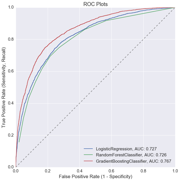
3. ROC plot
clfs.plot_roc_curve(X_test, y_test)
4. Profit curve
The cost benefit matrix defined here is in dollars, in the following format:
| Actual + | Actual - | |
|---|---|---|
| Predicted + | True Positive | False Positive |
| Predicted - | False Negative | True Negative |
Cost benefit matrix
We will assume that if the model predicts that a user will churn, we will spend $150 dollars retaining them (in promotions, marketing, etc.). If we successfully identify a customer who will churn and manage to retain them, we will gain in customer lifetime value minus the cost of retaining them ($325 - $150).
| Actual + | Actual - | |
|---|---|---|
| Predicted + | Correctly Predict Active $0 |
Falsely Predict Active $0 |
| Predicted - | Falsely Predict Churn -$150 |
Correctly Predict Churn $175 |
# Define cost-benefit matrix with input from business managers, other stakeholders, etc.
costbenefit_mat = np.array([[0, 0],
                            [-150, 175]])
# Plot profit curves
clfs.plot_profit_curve(costbenefit_mat, X_test, y_test)
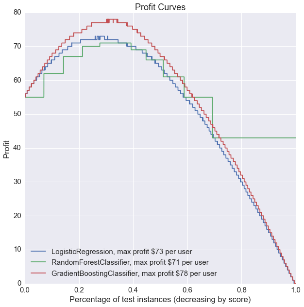
Without any model tuning, gradient boosting seems to be the best performer based on all 3 of our metrics: highest test accuracy, ROC curve with highest AUC, and highest profit.
6. Hyperparameter Tuning
GridSearchCV is a brut-force way of optimizing our model parameters like learning rate, tree size, etc. It runs through each combination of search parameters you specify, and compares them based on a specified scoring method (‘accuracy’, ‘f1’, ‘roc_auc’, etc.).
Tuning the gradient boosting parameters:
# To grid search a pipeline object, you need to specify the step in pipeline,
# followed by paramater name. Example => 'step__parameter_name': [1, 2]

gb_params = {
    'classifier__learning_rate': [1.0, 0.01],
    'classifier__max_depth': [1, 6, 8],
    'classifier__min_samples_leaf': [2],
    'classifier__max_features': ['sqrt', 'log2', None],
    'classifier__n_estimators': [500, 1000],
    'classifier__subsample': [0.25, 0.5]
}

gb_pipeline = Pipeline([
                ('featurize', mapper),
                ('scale', StandardScaler()),
                ('classifier', GradientBoostingClassifier())
                ])

gb_grid = GridSearchCV(gb_pipeline, gb_params, scoring='accuracy') # scoring could also be 'f1', 'roc_auc', etc.
gb_grid = gb_grid.fit(X_train, y_train)

best_gb_model = gb_grid.best_estimator_
best_gb_params = gb_grid.best_params_
Tuning the random forest parameters:
rf_params = {
    'classifier__max_depth': [4, 8, None],
    'classifier__max_features': ['sqrt', 'log2', None],
    'classifier__min_samples_split': [1, 2, 4],
    'classifier__min_samples_leaf': [1, 2, 4],
    'classifier__bootstrap': [True], # Mandatory with oob_score=True
    'classifier__n_estimators': [50, 100, 200, 400],
    'classifier__random_state': [67],
    'classifier__oob_score': [True],
    'classifier__n_jobs': [-1]
    }

rf_pipeline = Pipeline([
                ('featurize', mapper),
                ('scale', StandardScaler()),
                ('classifier', RandomForestClassifier())
                ])

rf_grid = GridSearchCV(rf_pipeline, rf_params, scoring='accuracy') # scoring could also be 'f1', 'roc_auc', etc.
rf_grid = rf_grid.fit(X_train, y_train)

best_rf_model = rf_grid.best_estimator_
best_rf_params = rf_grid.best_params_
Now we can repeat what we did above with the best parameters from our grid search.
# Rebuild classifiers with best parameters from grid search
gb_params = {'learning_rate': 0.01,
             'max_depth': 6,
             'max_features': None,
             'min_samples_leaf': 2,
             'n_estimators': 1000,
             'subsample': 0.25}

rf_params = {'bootstrap': True,
     'max_depth': 8,
     'max_features': None,
     'min_samples_leaf': 2,
     'min_samples_split': 1,
     'n_estimators': 400,
     'n_jobs': -1,
     'oob_score': True,
     'random_state': 67}

# List of classifiers
lr = LogisticRegression()
rf_tuned = RandomForestClassifier(**rf_params)
gb_tuned = GradientBoostingClassifier(**gb_params)
clfs_tuned = Classifiers([lr, rf_tuned, gb_tuned])
clfs_tuned.create_pipelines(mapper)
clfs_tuned.train(X_train, y_train)
clfs_tuned.accuracy_scores(X_test, y_test)
                   Classifier  Test Accuracies
0          LogisticRegression         0.762524
1      RandomForestClassifier         0.790041
2  GradientBoostingClassifier         0.801028
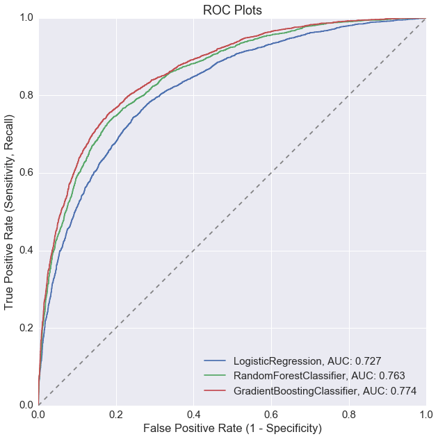
clfs_tuned.plot_roc_curve(X_test, y_test)
clfs_tuned.plot_profit_curve(costbenefit_mat, X_test, y_test)
Model tuning improved the random forest model the most, but overall, the gradient boosting model is still our best performer for active user prediction.